Logo Variations: Examples + Types of Logos You Need
July 18, 2025
When working with a brand designer, you can expect a selection of logo variations as part of your deliverables. Let’s review the different types of logos and why each plays an important role in your business’s visual identity. (Plus, we know how confusing industry jargon can be, so we’re going to clarify the terms and break them down for you here!)
Defining logo variations: What are they?
Essentially, logo variations are different versions of your primary logo. While the styling will be similar to the original, the format of each logo variation will change depending on the use-case for each of them.
For example, if the primary version of your logo is your full name and tagline, the altered logo could be just your initials with the tagline bordering them. Or if your primary logo is horizontally oriented, another version of your logo could be stacked vertically. Regardless of the variation, it’s important to keep a cohesive and consistent feel throughout the different forms to keep your brand visuals easily identifiable as yours.
Why do you need logo variations?
Regardless of your business type, you’ll need at least two versions of your logo to brand the various aspects of your brand. From your website to client communications, social media, and tangible products, each situation calls for different logos.
Even just something as simple as a stamped notebook with your brand may need a different look and feel than the logo at the top of your website.
Having a collection of logo variations in your toolkit and ready to go helps to keep a cohesive and versatile brand identity across all channels, for whatever use you may have.
The Main 4 Logo Variations: Examples + Placements
To note: although these are the most common logo variations, all four aren’t always needed for every business. The number of variations you need will depend on your type of business and where your logo will be displayed. If you are unsure about how many brand visuals you’ll need, let’s have a chat about the possibilities to determine what will be best for your business.
Now, let’s review the different logo variations, their uses, and placements.
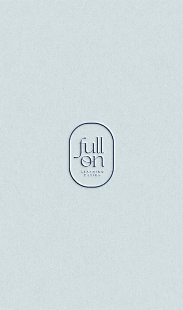
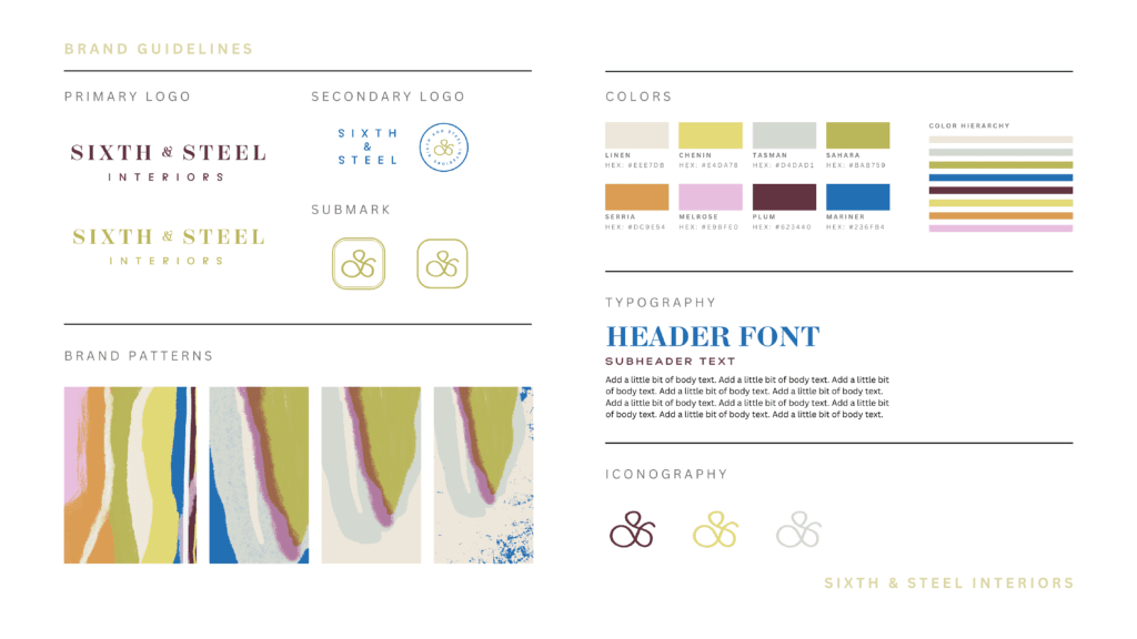
Primary Logo
This is the main, and often most detailed or complex version of your logo. As the front-and-center representation of your brand identity, this should be your go-to logo and the most identifiable visual for your brand. Your primary logo will be used to identify your brand, establish brand recognition, and can oftentimes create associations to your brand.
These are typically horizontal in orientation and are the largest of your variations.. Primary logos can also include taglines, locations, icons, illustrations, dates, and more. Due to its size and additional details, this will be best used for all of the main branding elements of your company, including business cards and potentially your website header. The rest of your logo variations will be very clearly inspired by your primary logo.
Secondary Logo
This is a modified version of the primary logo, often with a slightly different arrangement of the elements. Generally, the secondary logo can be simpler than your primary logo and more compact.
For example, if your primary logo is horizontal with a symbol above the text, the secondary logo can have the words stacked with the symbol next to them.
The idea is to have two different orientations ready to use for whatever the medium calls for. There will be applications where your entire logo may feel too large or detailed. This is where the secondary version will come into play. Secondary logos are great for email signatures, mobile website headers, or invoices.
Submark
This is one of our favorite logo variations because it’s usually more design-focused with less text, and can look beautiful on cover pages, journals, client experience materials like your welcome guide, and so much more.
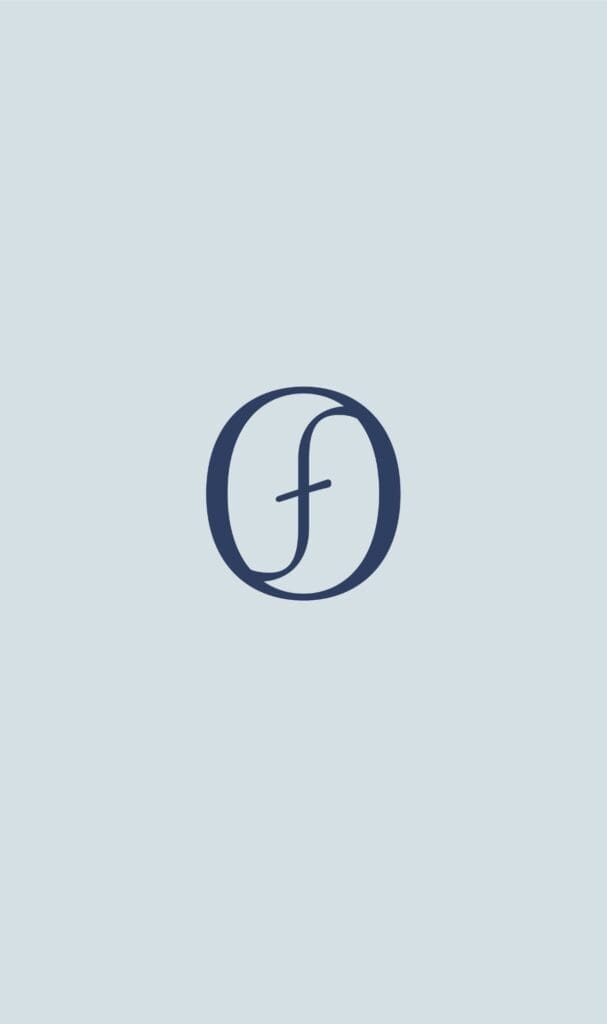
Simplified and condensed, the submark is best used in smaller spaces. Here, many aspects of your original logo will either have to be reshaped, reoriented, or left out altogether. Oftentimes, these logos are designed to fit within a circle which typically leaves room for just the business name and icon (or just the icon!).
But that doesn’t mean this logo is any less important! Since its most common use will be on social media, this could be the variation of your logo that is seen most often by potential clients and target audiences. You can also use the submark for things like stickers or website footers.
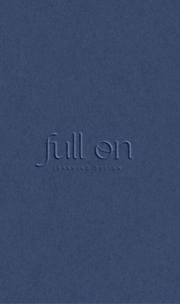
Logotype (wordmark)
Also known as the wordmark, less is more with the logotype. Typically optional, this is the version consisting solely of your brand name in a specific, on-brand font and style. These are most often horizontally oriented and are centered around the company’s full name, or sometimes initials. A good wordmark is memorable, easy (and beautiful) to look at, and highly usable for a wide variety of display options.
Although this is the most simple version of your logo, it is just as important because it represents the most recognizable part of your business: your name. For this reason, it’s best to keep your logotype legible, timeless, and unique. Your wordmark is best used when a symbol or an image isn’t necessary, or would be too cluttered. Think: business products, labels, and large-scale signs.
Icons
Of the listed variations, this is not a must, but they can still be useful. Icons are similar to submarks, but are even smaller and usually only include your brand’s initials or a tiny illustration from your brand imagery.
Typically a circle or square shape, you’ll find these most often as favicons — the small branded icons at the left side of the website tabs on your desktop browser. These can also be useful on small branded items like stickers, key chains, stamps, etc.
How many logo variations do you need?
Ultimately, this depends on your business! Every brand needs a holistic brand identity, from color palettes to fonts, and yes, logo variations. But the number of logo variations depends on your industry, service, and product. At Hone, we design a strategic brand identity based on your foundational needs. We won’t ever force a logo type or brand element if it isn’t needed or aligned for your brand.
In the end, it’s important that every element of your visual identity supports your brand voice rather than distracts from it. Get in touch to discuss your business’s needs and the logo variations that will serve you best.