Wedding Venue Logo + Website Design
October 1, 2025
In the wedding industry, first impressions matter. For venues, the right branding doesn’t just showcase a location — it captures a feeling. A thoughtful logo and brand identity can speak volumes before a couple even steps foot on the property. When Anita and her family reached out to us to bring The Rockwater’s brand to life, we knew this was about more than a website or logo, it was about telling a story.
Let’s take a look at how this wedding venue logo, website, and brand identity reflect the values and natural beauty of this breathtaking location.
Mountain views meet timeless celebrations
Anita and her family built The Rockwater in 2021 on their property in northern Georgia. When they reached out to Hone, they were ready to take The Rockwater online and share their dream of a timeless, light-filled space with couples everywhere. The goal was clear: create a brand and digital home that would resonate with couples seeking an intimate wedding experience surrounded by natural beauty that feels like a destination getaway from the bustle of Atlanta.
The Rockwater was designed with intentional contrast in mind — balancing the rustic charm of a barn with a polished, elevated atmosphere. Anita envisioned reaching couples from nearby cities who were looking for a slower, more grounding celebration. We wanted to make sure the brand felt just as meaningful and memorable as the weddings the venue would host.

Balancing warmth and refinement in a wedding venue logo
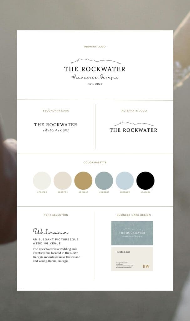
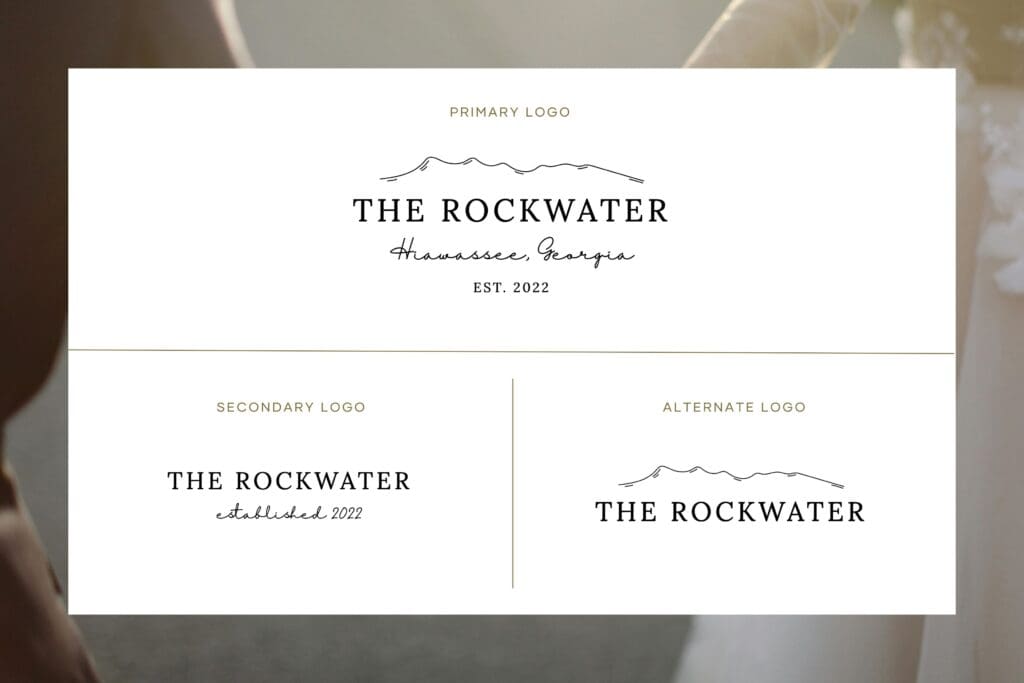
Our goal with the brand identity was to target higher end clientele by softening the venue’s rugged textures with a refined elegance. The logo we created features an outline of the surrounding mountainscape — a grounding element that connects the venue back to its roots. The name of the venue is written in a timeless serif font while the location is in a graceful script underscored by the year it was established, anchoring the brand in a sense of legacy.
Typography also played a key role in the story here. We paired a bold, simple serif font with a flowing handwritten script to reflect the strength and softness — a balance that mirrors the venue itself. The serif brings structure and sophistication, while the script lends a personal touch.

The calming color palette for this wedding venue logo
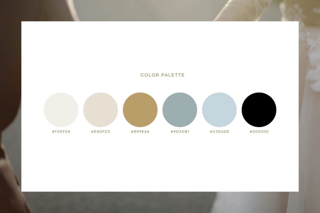
For the color palette, we leaned into tones that speak to the wedding experience at the venue itself: soft, classic, and calming. Creamy whites and muted blues became the foundation of The Rockwater’s identity. In the wedding industry, where stress can run high and decisions feel endless, these hues created a sense of calm and clarity for couples planning their celebration.

Let’s create your wedding venue’s unique brand identity
From the start, this project came from the desire to share the experience of Anita’s land with others. Through thoughtful branding and a custom website, we brought that vision to life — creating a space that doesn’t just share information, but extends an invitation to come, celebrate, and stay awhile.
Start the conversation so we can create a similar experience for your wedding venue logo and website.